Introduction
Aria is a conceptual skincare brand designed around the idea of lightness, both in meaning and in experience. The name “Aria,” derived from Italian, translates to “air” or “light,” reflecting the brand’s core identity: products that feel weightless and effortless on the skin. Clean, simple ingredients are another core value of Aria. This project explores how visual identity can communicate that sensory experience through branding.
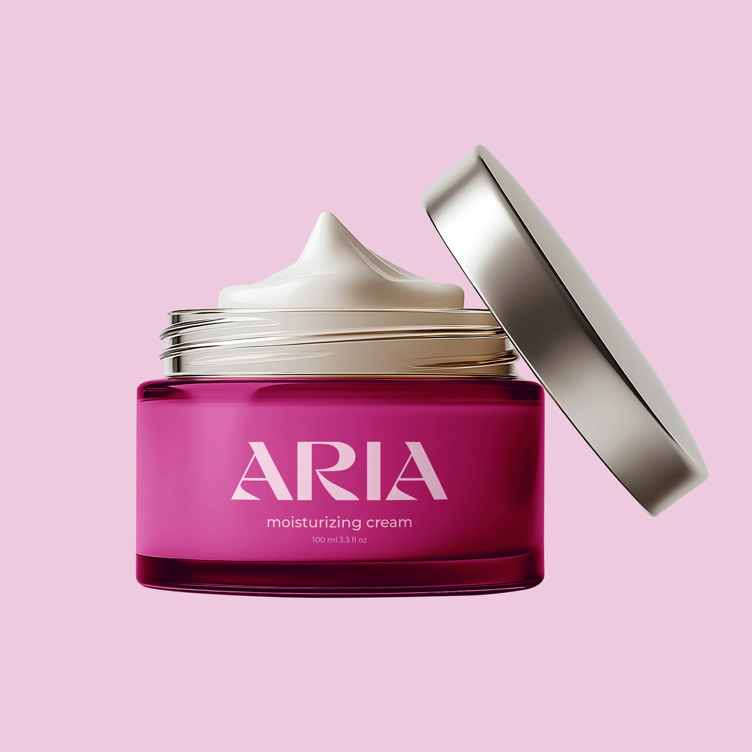
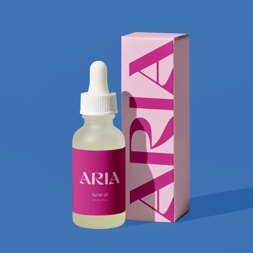
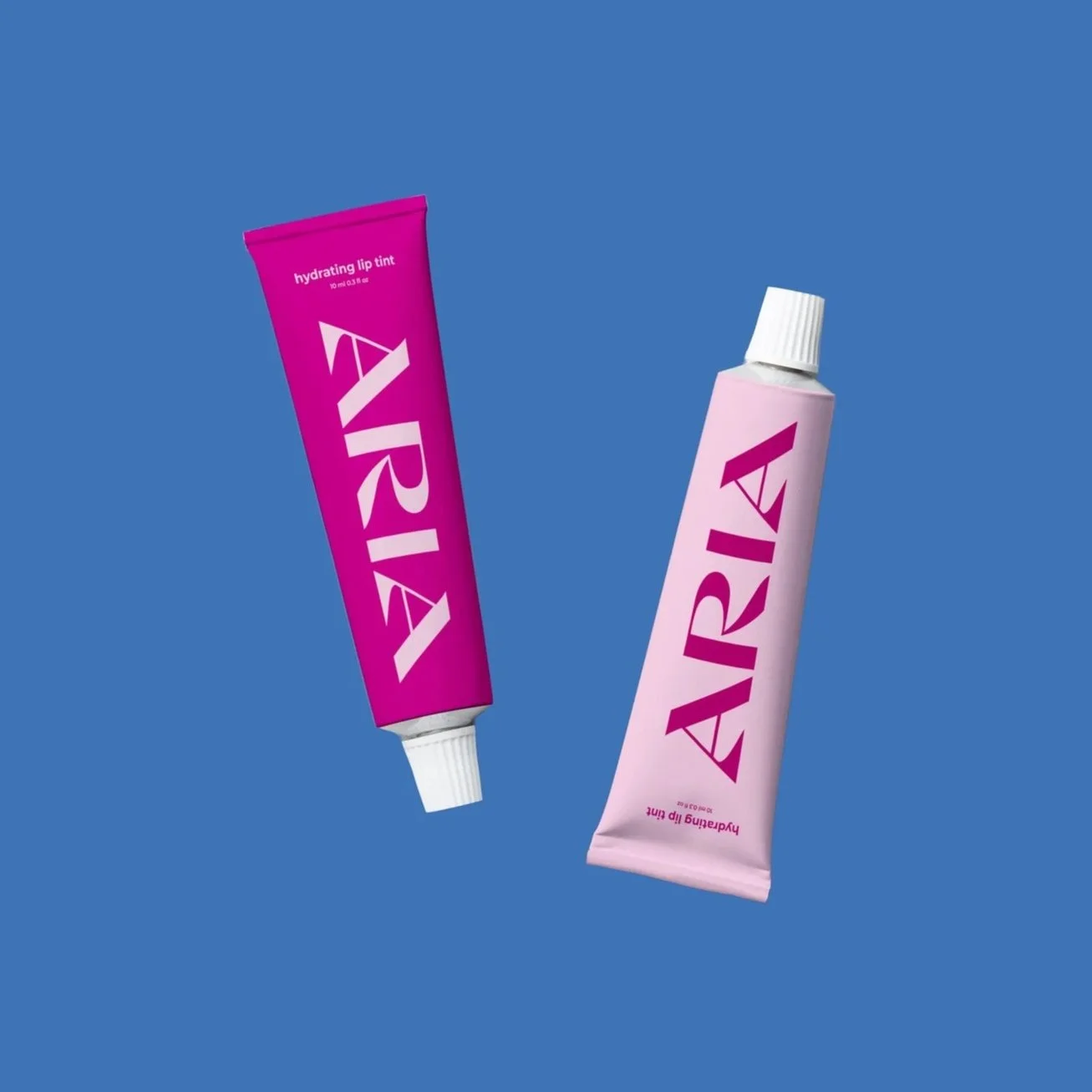
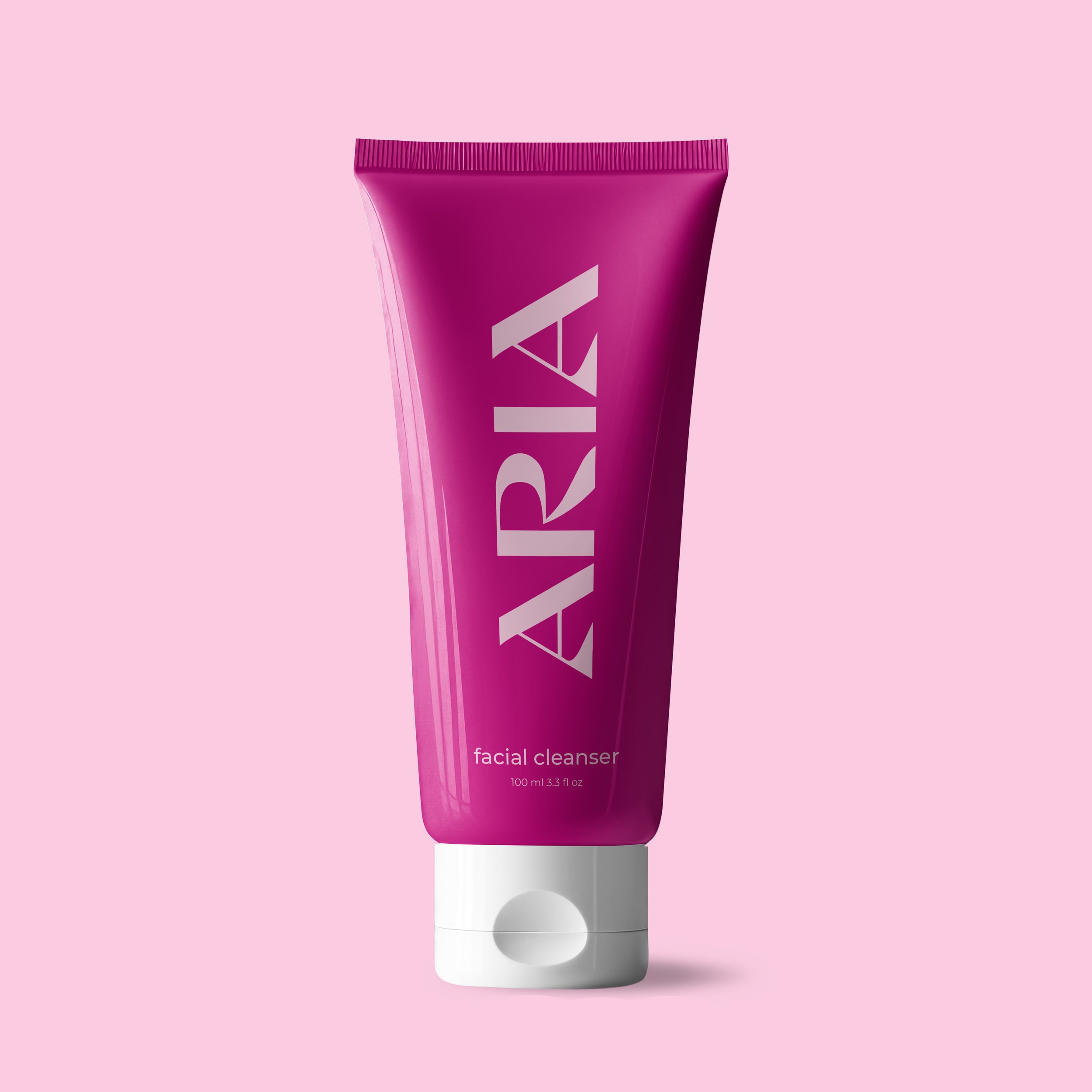
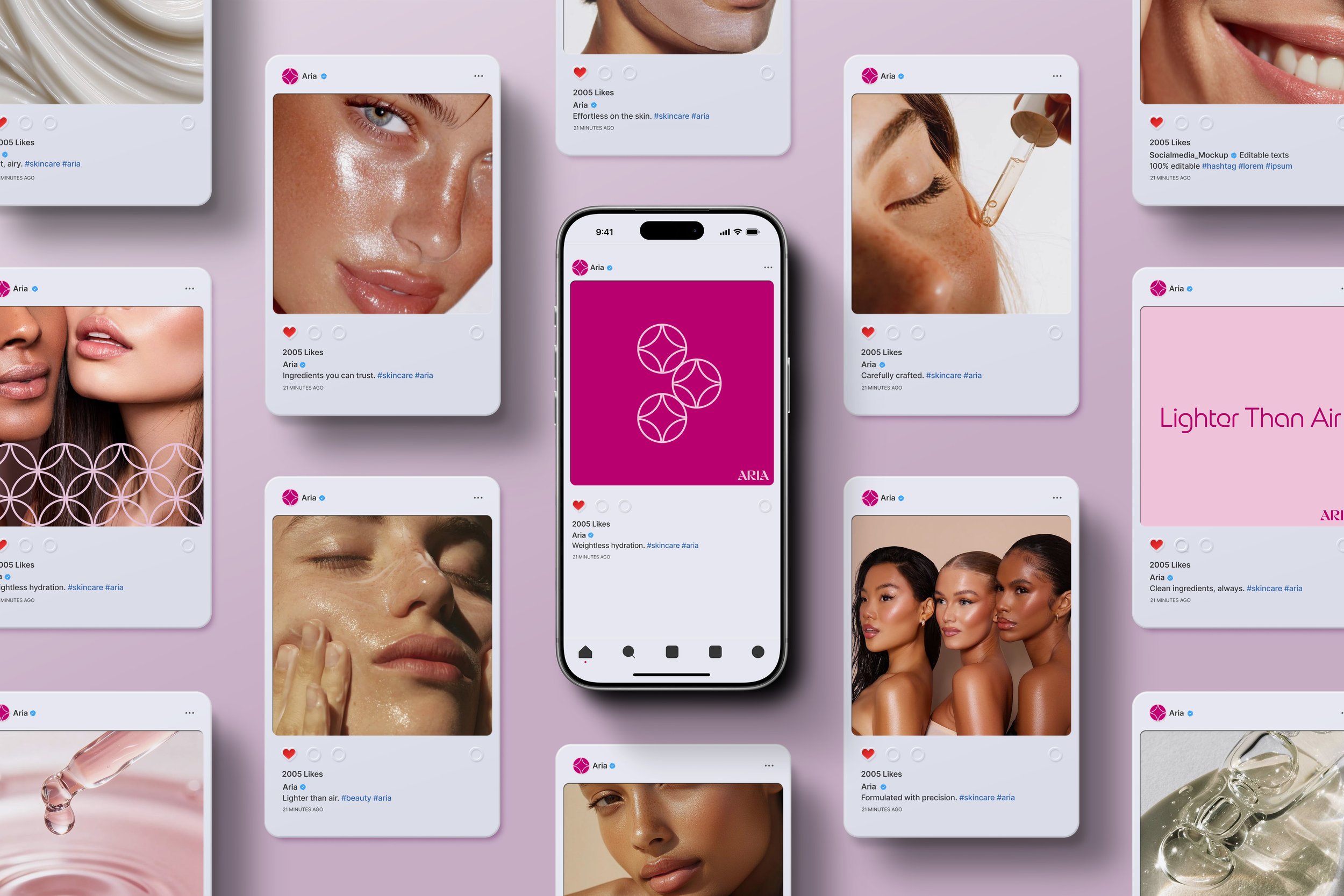
Aria offers premium skincare with clean, high-quality ingredients meant to nurture the skin. With weightless formulas, Aria is lighter than air.
Project Summary
This project focused on developing a distinctive visual identity for Aria, a modern skincare line centered on lightweight formulations. I wanted the brand to feel fresh, minimal, and airy, while still standing out in a crowded beauty market.
The process involved exploring typography, logo design, color systems, and supporting brand elements to create a cohesive identity that reflects both the physical experience of the product and its conceptual foundation. A strong emphasis was placed on expressing intangible qualities such as lightness, softness, and clarity into visual form.
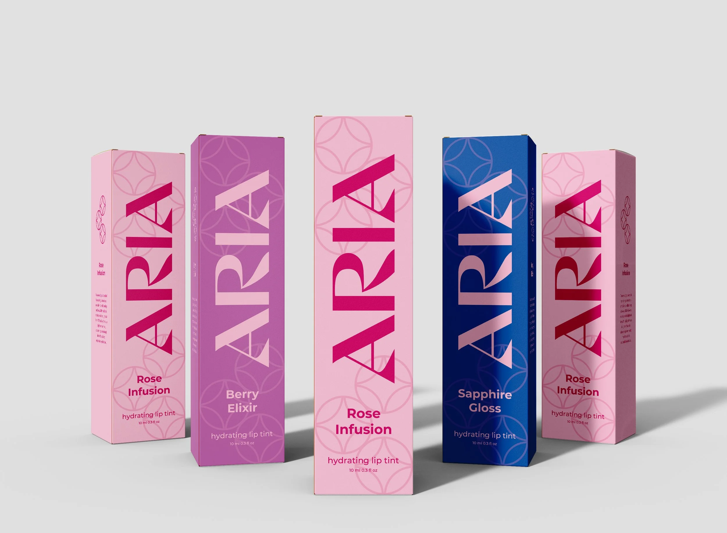
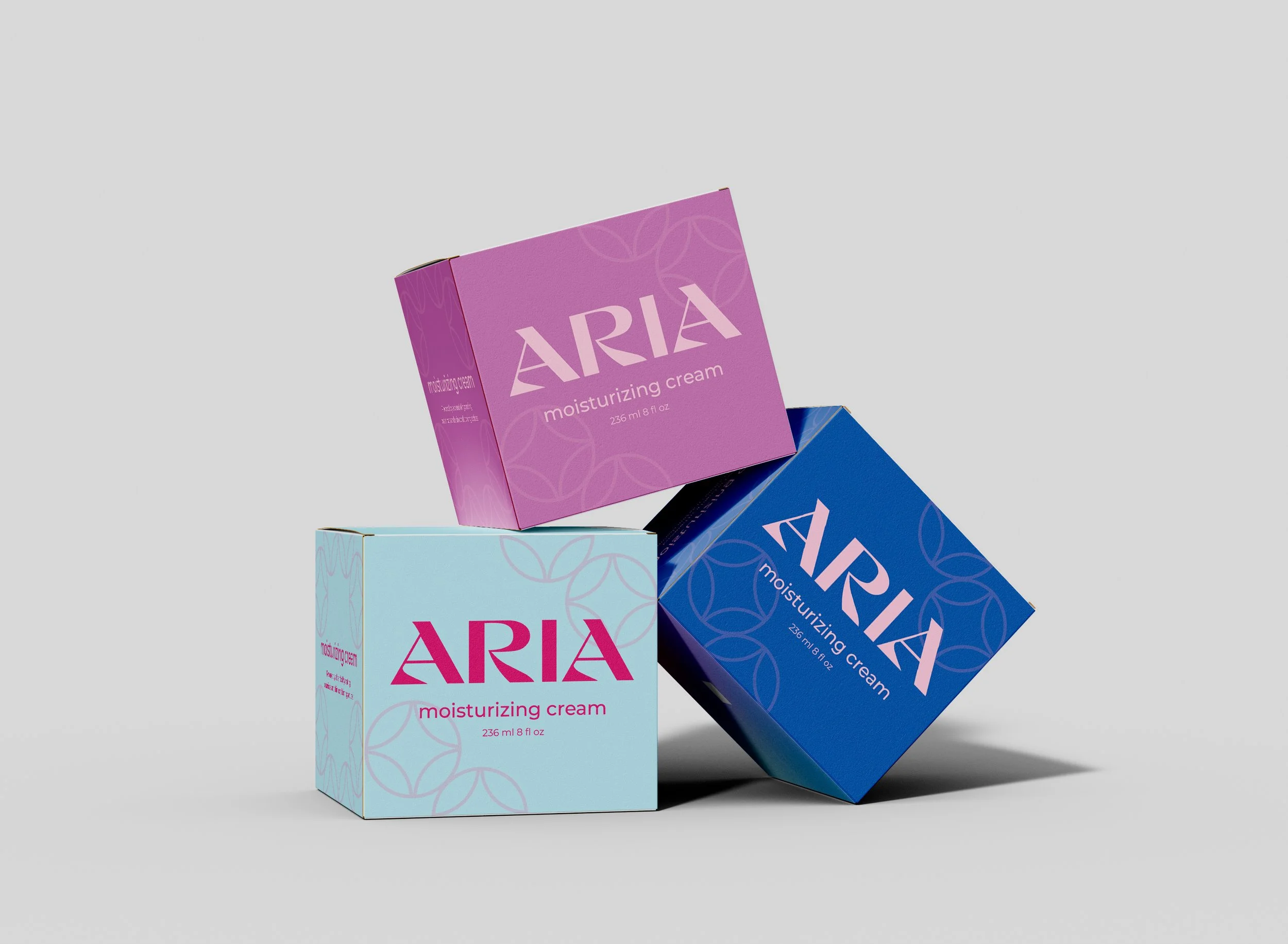
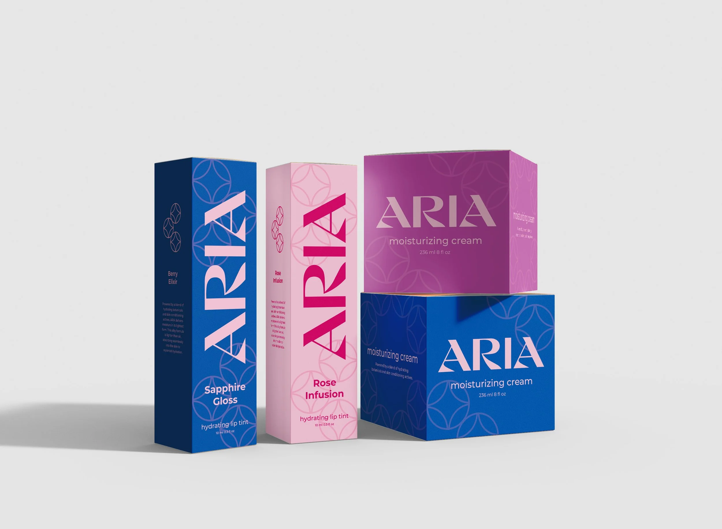
In addition to the primary logo, the project expanded into a flexible visual system that includes a secondary mark, color palette, and brand language. Together, these elements work to create a consistent yet dynamic identity that can adapt across packaging, digital applications, and promotional materials while maintaining a clear and recognizable presence.
Problem & Explanation
The primary challenge was developing a strong and recognizable brand identity that balanced playfulness with sophistication. Skincare branding often leans heavily into minimalism, which can feel repetitive and indistinct.
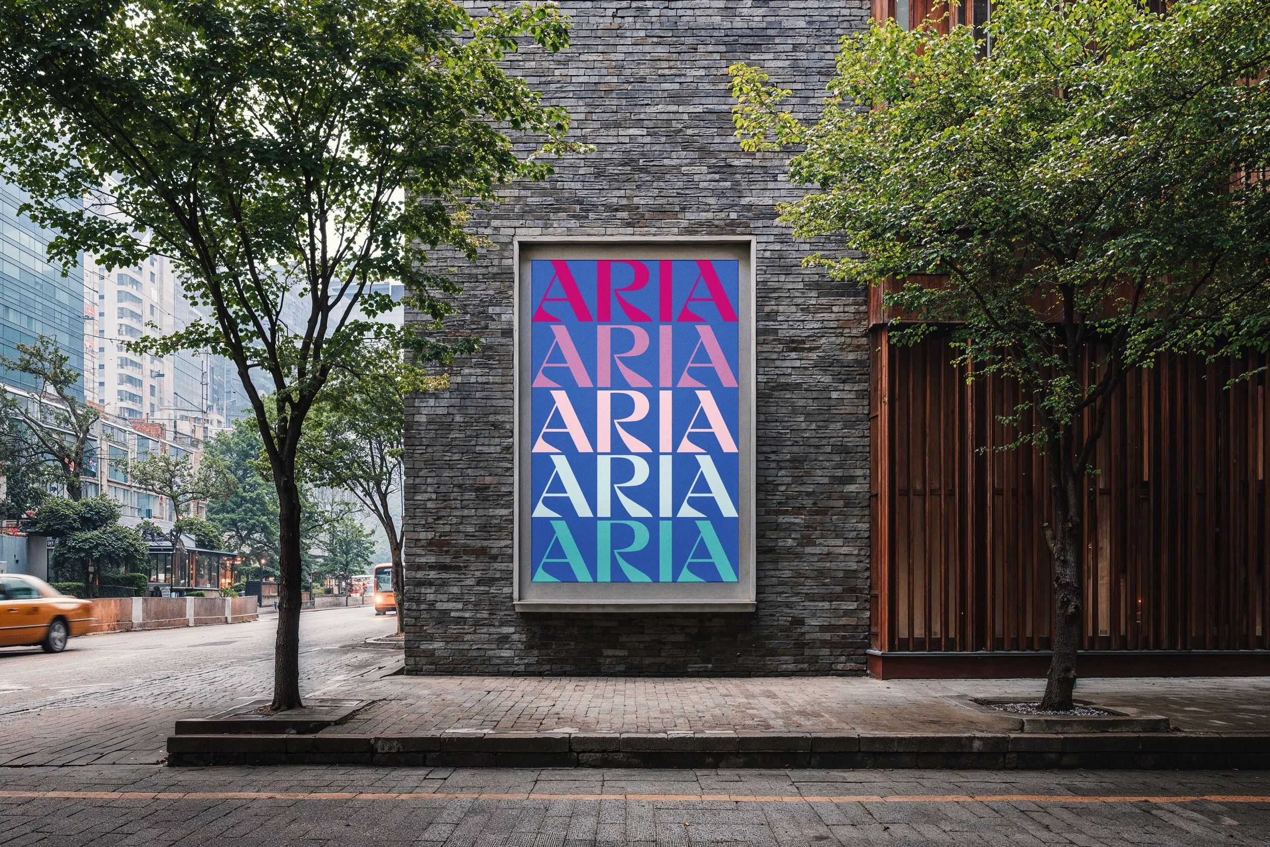
I reframed this challenge as an opportunity: instead of avoiding experimentation, I aimed to embrace it, using typography as the main expressive element while still maintaining a clean, “light” aesthetic that aligns with the product experience.
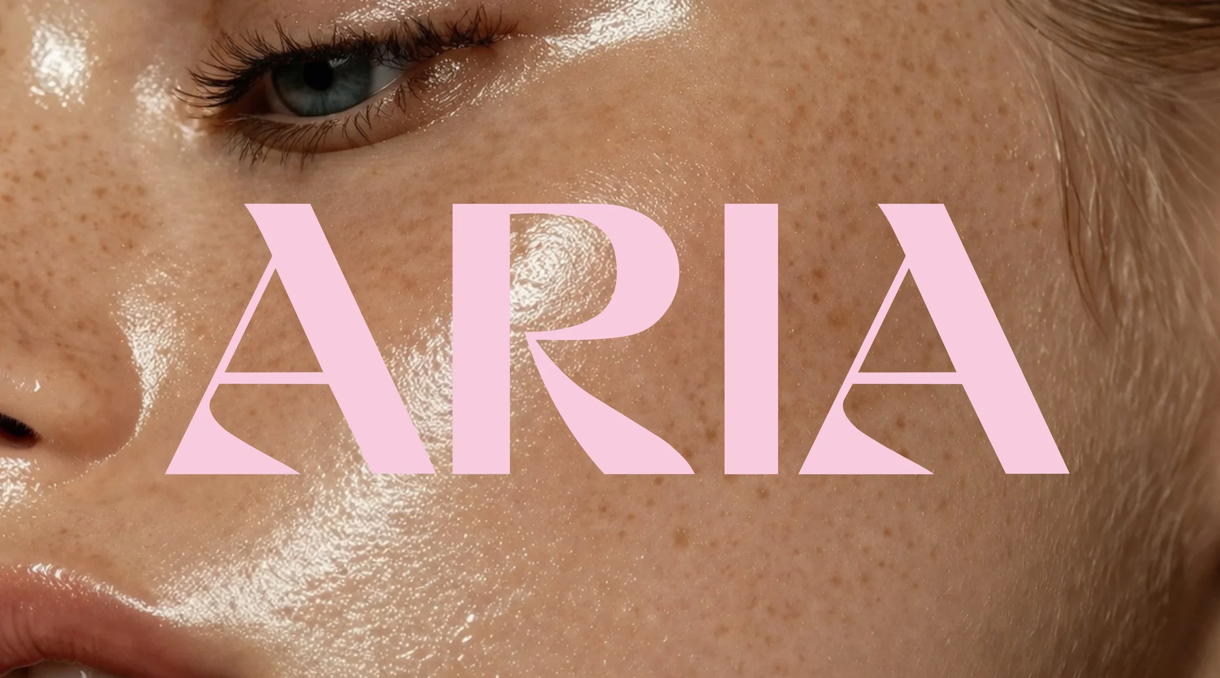
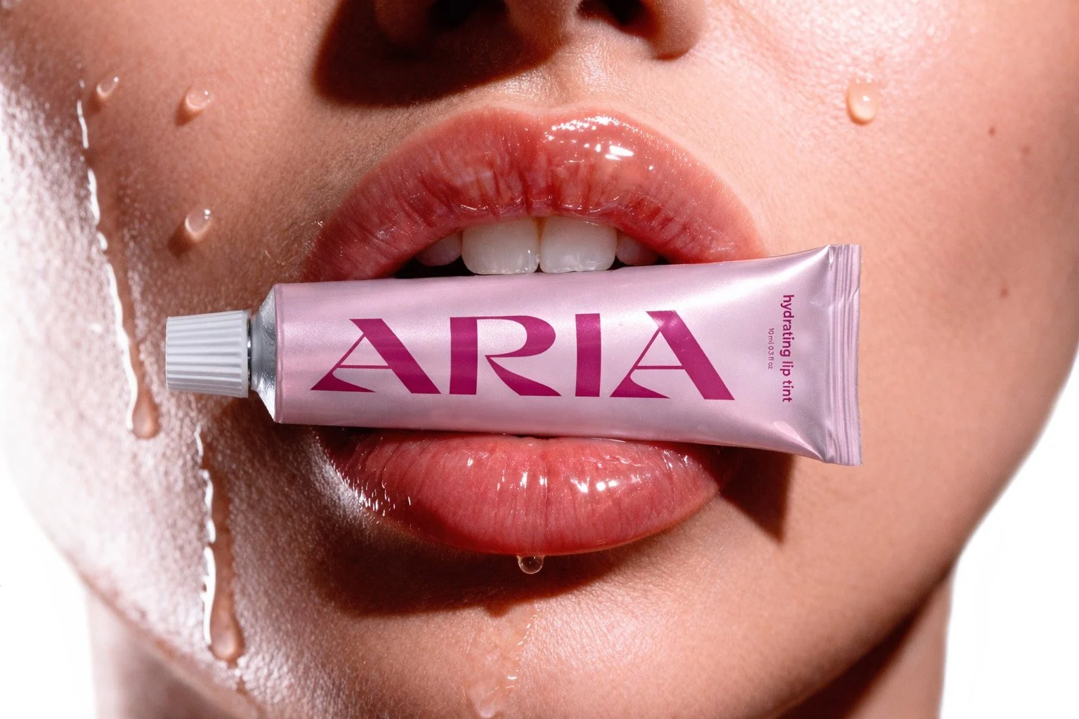
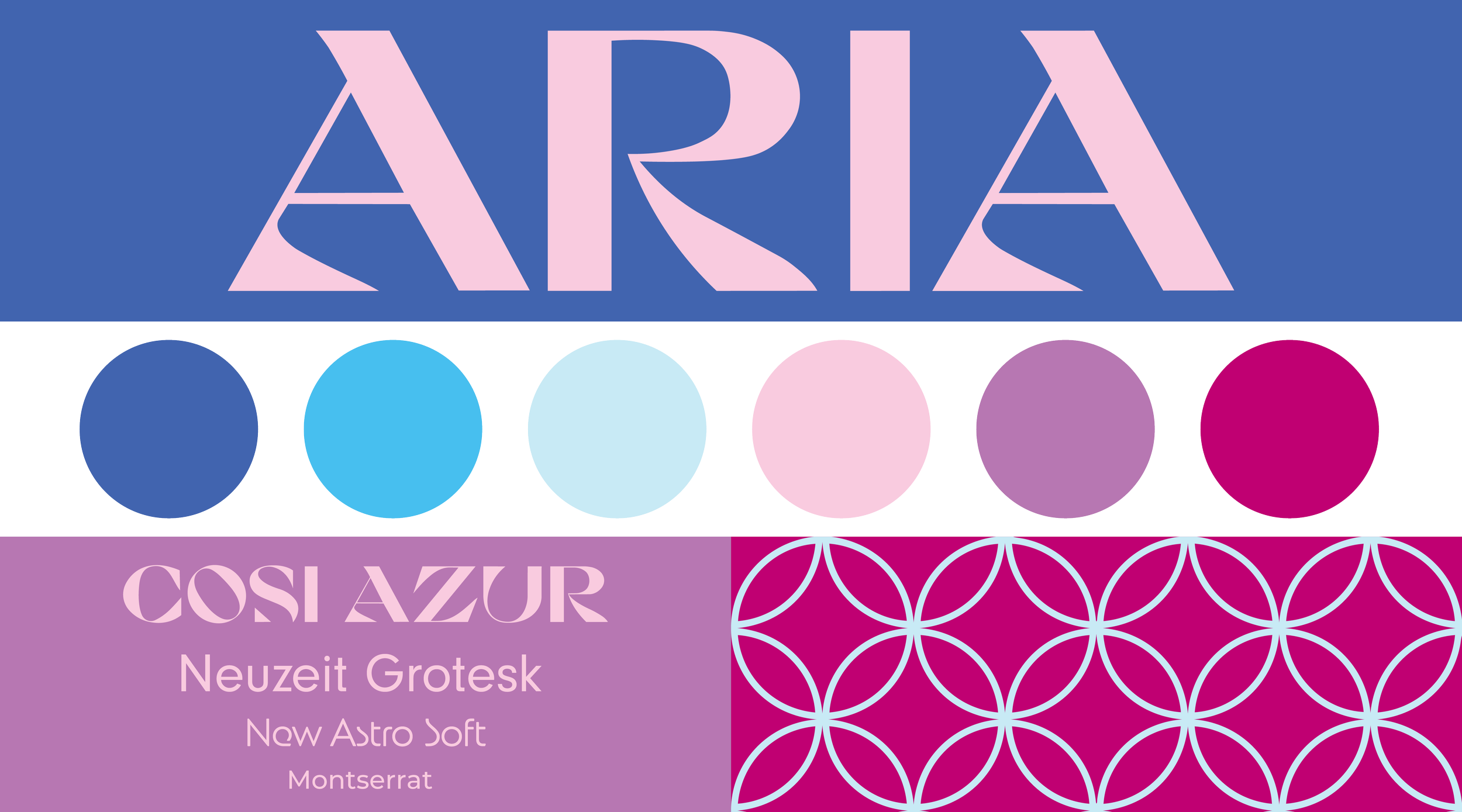
The typographic treatment pulls inspiration from scientific precision and contemporary skincare aesthetics, particularly the visual language of lab-based beauty brands and modern cosmetic technology. Sharp, clean, and smooth letterforms communicate a sense of accuracy, control, and refinement. This subtle reference to science reinforces Aria’s commitment to trustworthy, high-quality ingredients, suggesting that each product is carefully formulated with care and intention. At the same time, the refined typography introduces a slightly futuristic quality, positioning the brand as forward-thinking within the skincare space.
Exploration & Ideation
I began by brainstorming visual directions that could represent “lightness.” Early ideas included softness, transparency, airiness, and fluid motion. I explored how these concepts could translate into typography and supporting visual elements.
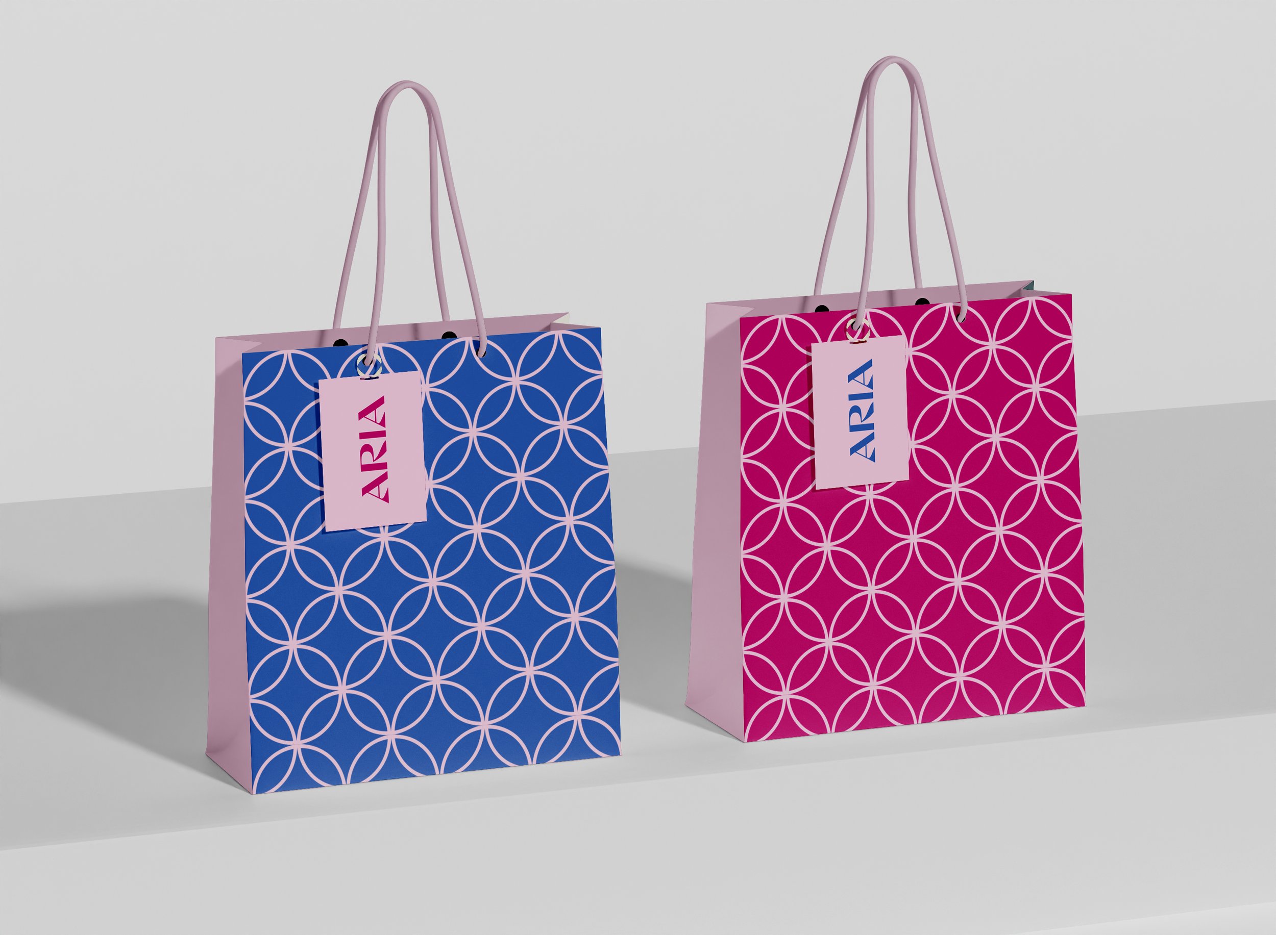
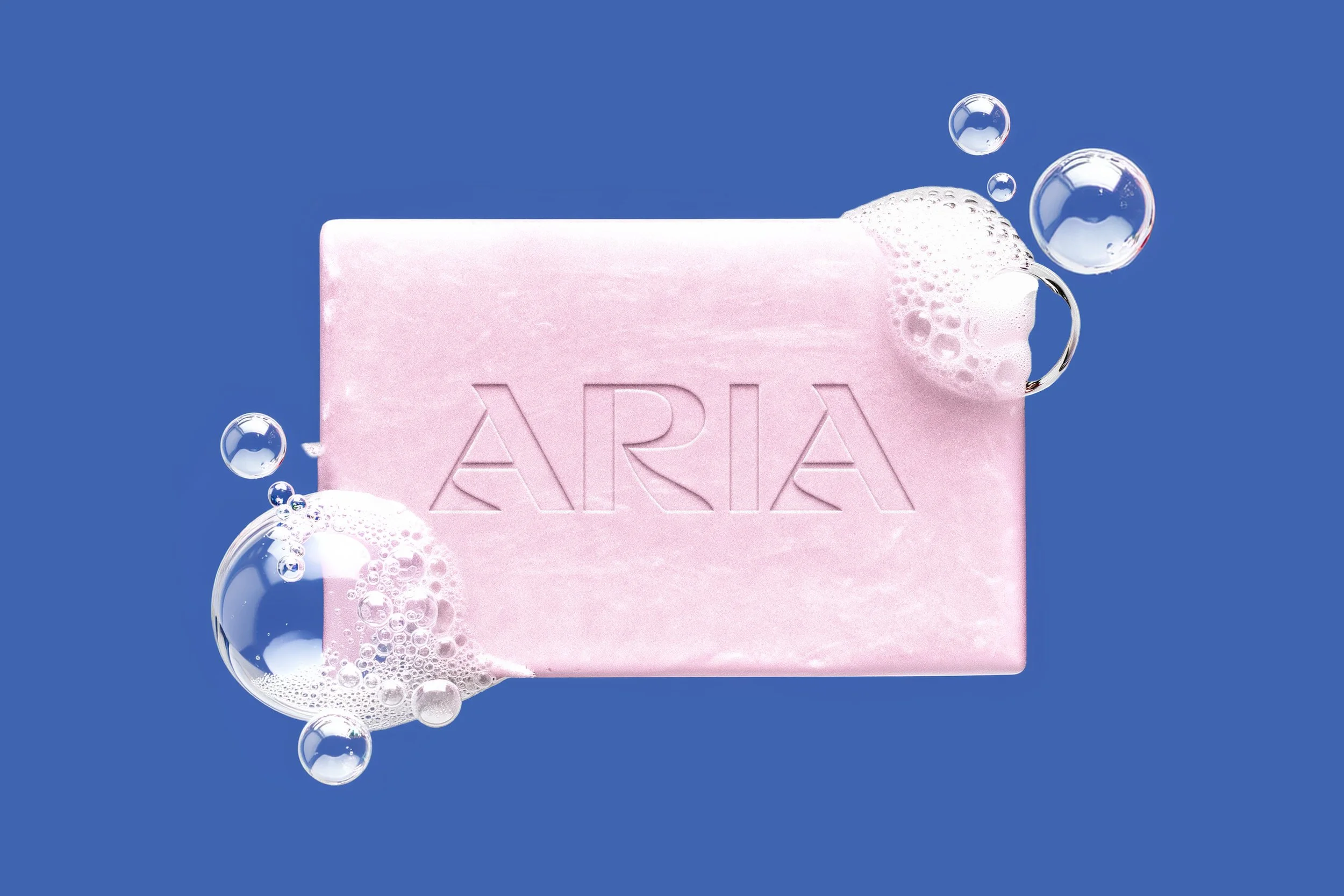
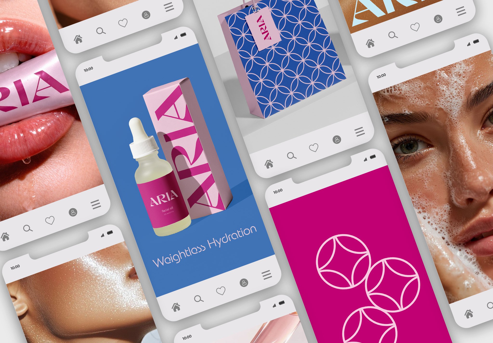
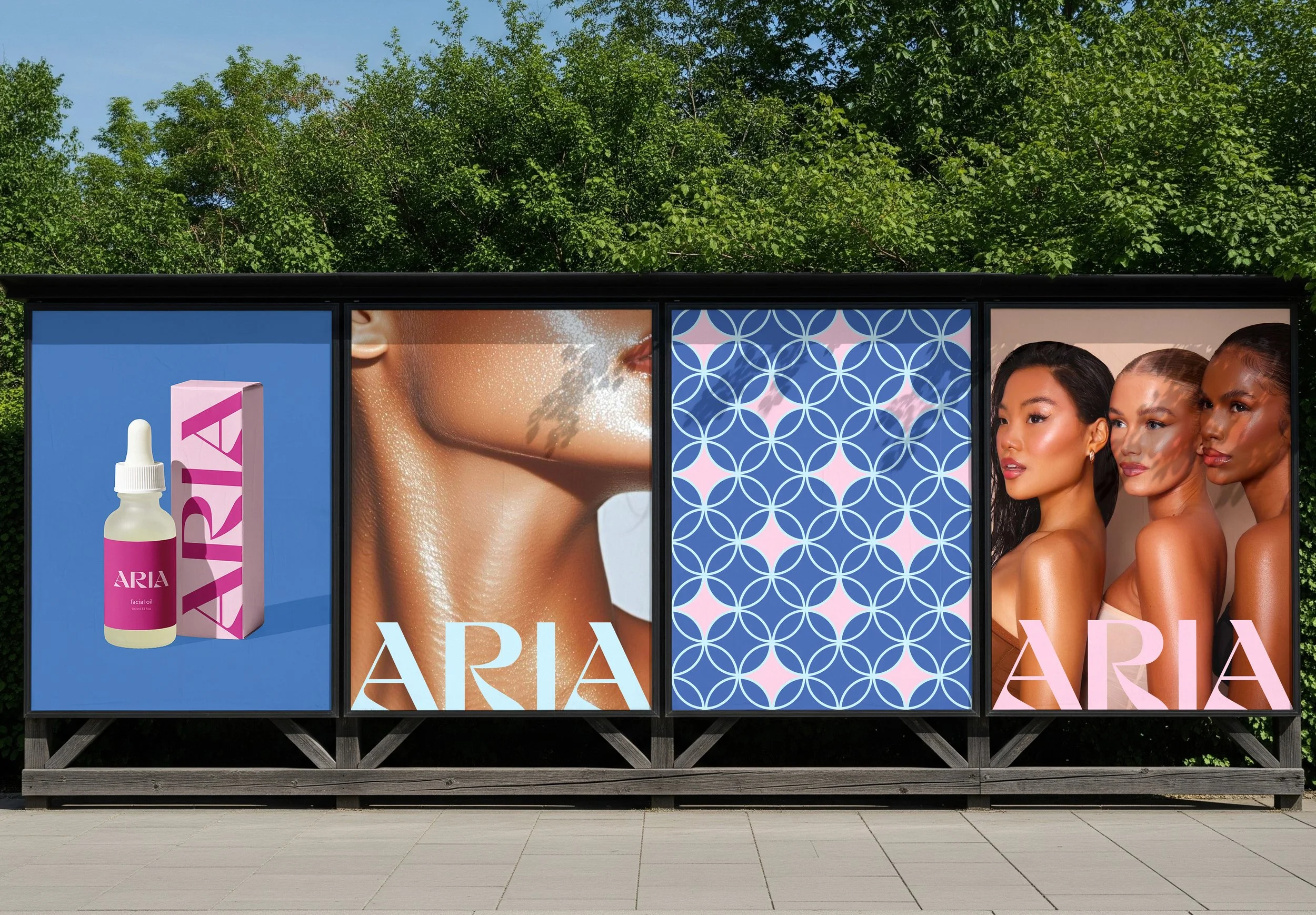
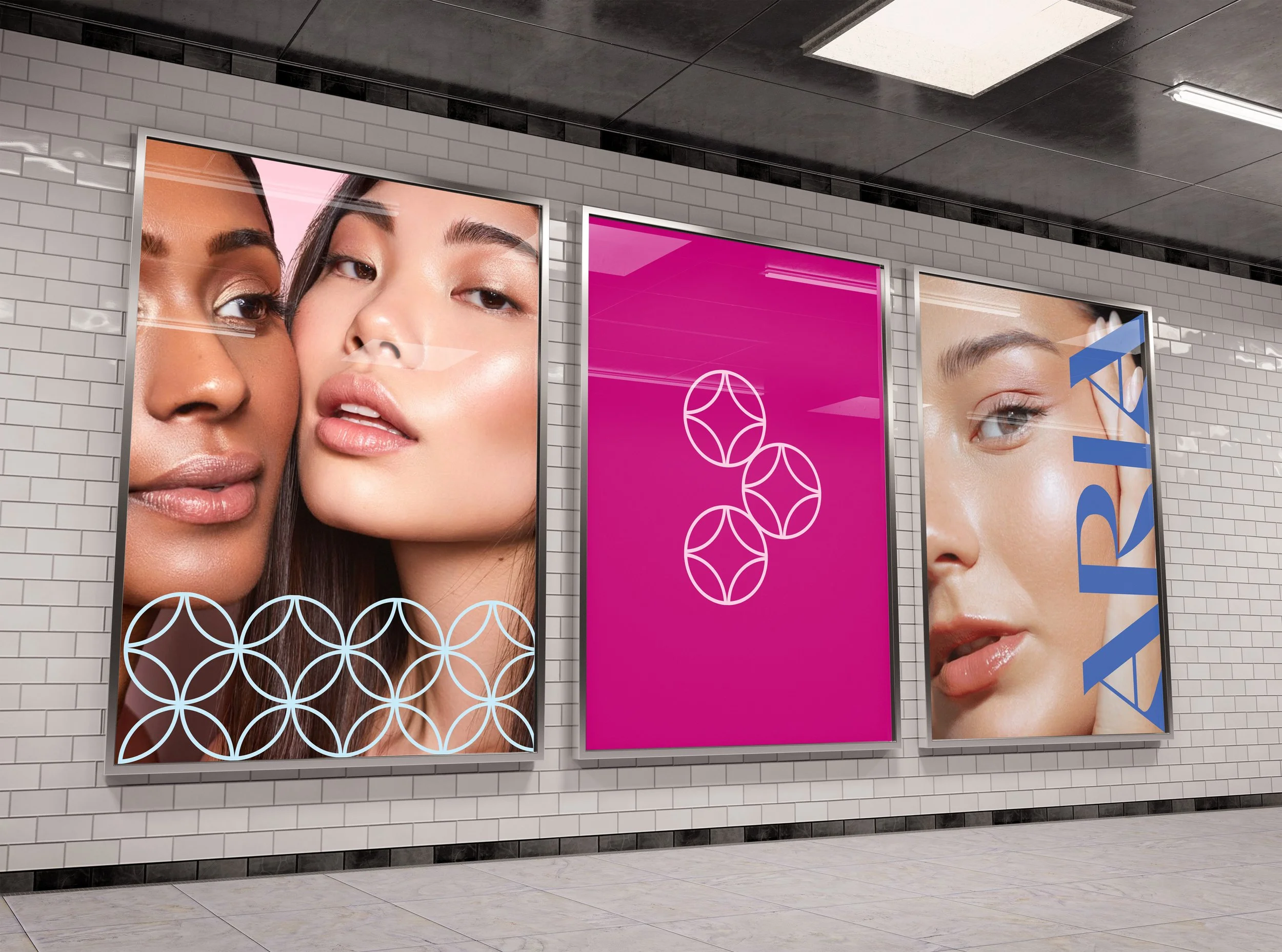
A large part of my concept focused on clean ingredients. The logo development reflects this through a dual inspiration: bubbles and molecular structures. The circular forms reference bubbles—commonly associated with cleansing, lightness, and air—while also subtly mimicking molecular diagrams.
This duality allows the logo to operate on two levels: visually, it feels soft, airy, and approachable, while conceptually it communicates purity, formulation, and scientific credibility. By merging these ideas, the identity reinforces both the sensory experience of the product and the integrity of its ingredients.
Competitive Analysis
When looking at existing skincare brands, I noticed a clear pattern in how they present themselves. Many rely on minimal design choices like neutral color palettes, simple sans serif typography, and very clean layouts. While this approach works well in communicating simplicity and luxury, it often makes brands feel very similar and sometimes hard to distinguish from one another.
A lot of these brands lean into restraint to express purity and sophistication, but in doing so, they can lose a sense of personality or memorability. This became an important realization in shaping my direction for Aria.
Instead of strictly following that visual language, I saw an opportunity to push it further. I wanted to keep the clarity and refinement that people expect from skincare branding, while introducing more expressive elements that would make the brand feel unique. By incorporating experimental typography and visual ideas like bubbles and molecular structures, I aimed to create a system that feels both elevated and distinctive, while still communicating trust, cleanliness, and quality.
Challenges & Pivot
At a certain point, I felt stuck. The typography experiments, while playful, did not fully communicate the brand’s essence. The designs leaned too heavily on style without clearly expressing the core idea of lightness.
This led me to step back and reassess the concept, looking for stronger visual metaphors that could better anchor the identity. I pivoted toward incorporating elements like bubbles and air—visual cues that directly represent lightness and weightlessness.
This shift helped ground the design in something more tangible while still allowing room for experimentation. I also expanded the concept through a secondary logo mark inspired by bubbles, along with supporting copy such as “lighter than air” and “weightless hydration,” which helped unify the visual and verbal identity.
Refined Direction
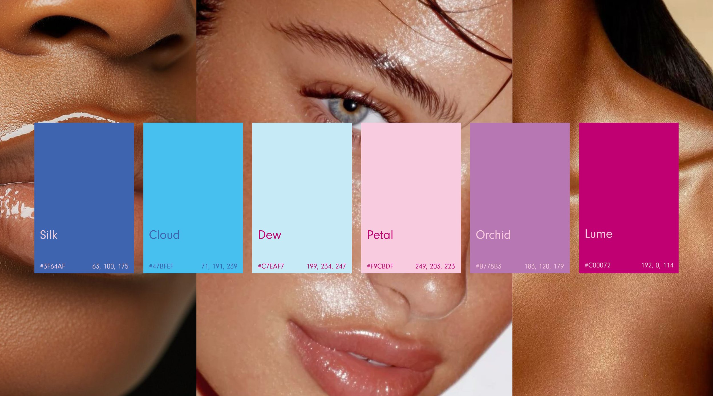
By combining subtle, airy visuals with an expanded color palette inspired by the iridescence of bubbles, the identity became more cohesive. The use of negative space, soft forms, and light-inspired elements reinforced the brand’s message while keeping the overall system clean and modern.
While my primary logo explores a clean, sharp, modern typographic style, my secondary logo draws inspiration from elements associated with the brand. I aimed to combine bubbles (light, airy, delicate) with molecular structures (clean ingredients, purity, and formulation integrity). This combination strengthens the connection between the product’s sensory experience and its scientific foundation.
Conclusion
My overall goal for this project was to experiment with expressive typography and logo design while creating a coherent brand identity based on its core values: the concept of lightness and clean ingredients.
This project taught me the importance of knowing when to step back and rethink a direction. While experimentation is valuable, it needs to be guided by a clear concept.
Through iteration and refinement, I was able to create a branding system that balances creativity with clarity. The integration of molecular-inspired forms with airy, bubble-like visuals allows Aria to communicate both lightness and scientific credibility.
Aria successfully communicates a sense of lightness—not just in name, but through every visual element—resulting in a brand that feels both distinctive and aligned with its purpose.
Credits
Designer: Julia Biordi
Professor: Jason Kernevich
Institution: Tyler School of Art and Architecture, Graphic + Interactive Design